Basic Card
This is a standard elevated card
Cards contain content and actions about a single subject. They are surface containers that hold content and actions.
'/%3e%3cmask%20id='mask0_9_872'%20style='mask-type:alpha'%20maskUnits='userSpaceOnUse'%20x='6'%20y='4'%20width='36'%20height='40'%3e%3cpath%20d='M24%204C24.5482%204.00001%2024.9883%204.45197%2024.9746%205L24.6709%2017.1621C24.5849%2020.5989%2027.3985%2023.4047%2030.835%2023.3096L41%2023.0273C41.0018%2023.0273%2041.004%2023.0274%2041.0059%2023.0273L34.7773%2023.2002C34.3417%2023.7145%2033.8816%2024.2366%2033.3945%2024.7607L41.0078%2024.9717C41.0053%2024.9716%2041.0025%2024.9727%2041%2024.9727L30.8359%2024.6895C27.3992%2024.5939%2024.5851%2027.4%2024.6709%2030.8369L24.9746%2043C24.9883%2043.548%2024.5482%2044%2024%2044C23.4518%2044%2023.0117%2043.548%2023.0254%2043L23.0918%2040.3428C23.683%2040.0243%2024.2804%2039.6846%2024.8828%2039.3252L24.707%2032.2949C24.2237%2032.6328%2023.7425%2032.9537%2023.2676%2033.2617L23.3281%2030.8369C23.4139%2027.4001%2020.6005%2024.5942%2017.1641%2024.6895L7%2024.9727C6.45248%2024.9879%206.00002%2024.5477%206%2024C6%2023.4523%206.45249%2023.0121%207%2023.0273L17.1641%2023.3096C20.6006%2023.4049%2023.4139%2020.5989%2023.3281%2017.1621L23.0254%205C23.0117%204.45198%2023.4518%204%2024%204ZM33.9033%2033.9033C34.2938%2033.5128%2034.9269%2033.5128%2035.3174%2033.9033L36.7305%2035.3164C37.1209%2035.7069%2037.1209%2036.34%2036.7305%2036.7305C36.34%2037.121%2035.7069%2037.1209%2035.3164%2036.7305L33.9033%2035.3174C33.5128%2034.9269%2033.5128%2034.2938%2033.9033%2033.9033ZM14.0996%2014.0996C14.4901%2013.7091%2015.1231%2013.7092%2015.5137%2014.0996L18.3438%2016.9287C18.734%2017.3191%2018.7338%2017.9523%2018.3438%2018.3428C17.9532%2018.7333%2017.3192%2018.7333%2016.9287%2018.3428L14.0996%2015.5137C13.7092%2015.1232%2013.7092%2014.4901%2014.0996%2014.0996Z'%20fill='url(%23paint1_linear_9_872)'/%3e%3c/mask%3e%3cg%20mask='url(%23mask0_9_872)'%3e%3cg%20filter='url(%23filter0_f_9_872)'%3e%3ccircle%20cx='24'%20cy='24'%20r='8'%20fill='%2302FBFE'/%3e%3c/g%3e%3c/g%3e%3cpath%20d='M31.8526%2014.3238C31.4334%2013.8243%2031.5929%2013.0629%2032.1869%2012.7938C37.1308%2010.5547%2041.1875%2010.1494%2042.8482%2012.1286C45.6881%2015.5132%2040.4448%2024.5881%2031.1373%2032.3981C21.8296%2040.2081%2011.9822%2043.7954%209.14219%2040.4108C7.44591%2038.3888%208.63479%2034.3372%2011.8507%2029.7369C12.2215%2029.2065%2012.992%2029.1855%2013.408%2029.6812C13.7055%2030.0356%2013.7212%2030.5465%2013.4567%2030.9262C12.9771%2031.6149%2012.5485%2032.287%2012.1734%2032.9362C11.1817%2034.6527%2010.6225%2036.1137%2010.4381%2037.238C10.2524%2038.3706%2010.4801%2038.894%2010.6744%2039.1256C10.8688%2039.3572%2011.3443%2039.6724%2012.4918%2039.6862C13.631%2039.6999%2015.167%2039.4019%2017.0299%2038.7233C20.7392%2037.3719%2025.329%2034.6612%2029.8521%2030.8659C34.3752%2027.0705%2037.8421%2023.0215%2039.8169%2019.6032C40.8086%2017.8866%2041.3679%2016.4257%2041.5523%2015.3014C41.738%2014.1689%2041.5103%2013.6453%2041.316%2013.4137C41.1215%2013.1822%2040.6456%2012.868%2039.4986%2012.8542C38.3593%2012.8405%2036.8233%2013.1374%2034.9605%2013.8161C34.3505%2014.0383%2033.7169%2014.2978%2033.0636%2014.5926C32.6444%2014.7818%2032.1483%2014.6761%2031.8526%2014.3238Z'%20fill='url(%23paint2_linear_9_872)'/%3e%3cg%20filter='url(%23filter1_f_9_872)'%3e%3cpath%20d='M24%2018L24.8485%2023.1515L30%2024L24.8485%2024.8485L24%2030L23.1515%2024.8485L18%2024L23.1515%2023.1515L24%2018Z'%20fill='white'/%3e%3c/g%3e%3cmask%20id='path-6-inside-1_9_872'%20fill='white'%3e%3cpath%20d='M137.456%2031.9998H135.027V19.1121H137.456V31.9998ZM145.986%2023.324H146.129L148.614%2019.1121H151.638L147.732%2025.2683L151.961%2031.9998H148.938L146.129%2027.3562H145.986L143.178%2031.9998H140.154L144.366%2025.2683L140.478%2019.1121H143.484L145.986%2023.324Z'/%3e%3c/mask%3e%3cpath%20d='M137.456%2031.9998H135.027V19.1121H137.456V31.9998ZM145.986%2023.324H146.129L148.614%2019.1121H151.638L147.732%2025.2683L151.961%2031.9998H148.938L146.129%2027.3562H145.986L143.178%2031.9998H140.154L144.366%2025.2683L140.478%2019.1121H143.484L145.986%2023.324Z'%20fill='url(%23paint3_linear_9_872)'/%3e%3cpath%20d='M137.456%2031.9998V32.0998H137.556V31.9998H137.456ZM135.027%2031.9998H134.927V32.0998H135.027V31.9998ZM135.027%2019.1121V19.0121H134.927V19.1121H135.027ZM137.456%2019.1121H137.556V19.0121H137.456V19.1121ZM145.986%2023.324L145.9%2023.375L145.929%2023.424H145.986V23.324ZM146.129%2023.324V23.424H146.186L146.215%2023.3748L146.129%2023.324ZM148.614%2019.1121V19.0121H148.557L148.528%2019.0613L148.614%2019.1121ZM151.638%2019.1121L151.722%2019.1656L151.82%2019.0121H151.638V19.1121ZM147.732%2025.2683L147.647%2025.2147L147.614%2025.268L147.647%2025.3215L147.732%2025.2683ZM151.961%2031.9998V32.0998H152.142L152.046%2031.9466L151.961%2031.9998ZM148.938%2031.9998L148.852%2032.0515L148.881%2032.0998H148.938V31.9998ZM146.129%2027.3562L146.215%2027.3044L146.186%2027.2562H146.129V27.3562ZM145.986%2027.3562V27.2562H145.929L145.9%2027.3045L145.986%2027.3562ZM143.178%2031.9998V32.0998H143.234L143.264%2032.0515L143.178%2031.9998ZM140.154%2031.9998L140.069%2031.9467L139.973%2032.0998H140.154V31.9998ZM144.366%2025.2683L144.45%2025.3214L144.484%2025.2681L144.45%2025.2149L144.366%2025.2683ZM140.478%2019.1121V19.0121H140.296L140.393%2019.1655L140.478%2019.1121ZM143.484%2019.1121L143.57%2019.061L143.541%2019.0121H143.484V19.1121ZM137.456%2031.9998V31.8998H135.027V31.9998V32.0998H137.456V31.9998ZM135.027%2031.9998H135.127V19.1121H135.027H134.927V31.9998H135.027ZM135.027%2019.1121V19.2121H137.456V19.1121V19.0121H135.027V19.1121ZM137.456%2019.1121H137.356V31.9998H137.456H137.556V19.1121H137.456ZM145.986%2023.324V23.424H146.129V23.324V23.224H145.986V23.324ZM146.129%2023.324L146.215%2023.3748L148.7%2019.1629L148.614%2019.1121L148.528%2019.0613L146.043%2023.2732L146.129%2023.324ZM148.614%2019.1121V19.2121H151.638V19.1121V19.0121H148.614V19.1121ZM151.638%2019.1121L151.554%2019.0585L147.647%2025.2147L147.732%2025.2683L147.816%2025.3219L151.722%2019.1656L151.638%2019.1121ZM147.732%2025.2683L147.647%2025.3215L151.877%2032.053L151.961%2031.9998L152.046%2031.9466L147.816%2025.2151L147.732%2025.2683ZM151.961%2031.9998V31.8998H148.938V31.9998V32.0998H151.961V31.9998ZM148.938%2031.9998L149.023%2031.948L146.215%2027.3044L146.129%2027.3562L146.044%2027.408L148.852%2032.0515L148.938%2031.9998ZM146.129%2027.3562V27.2562H145.986V27.3562V27.4562H146.129V27.3562ZM145.986%2027.3562L145.9%2027.3045L143.093%2031.948L143.178%2031.9998L143.264%2032.0515L146.071%2027.4079L145.986%2027.3562ZM143.178%2031.9998V31.8998H140.154V31.9998V32.0998H143.178V31.9998ZM140.154%2031.9998L140.238%2032.0528L144.45%2025.3214L144.366%2025.2683L144.281%2025.2153L140.069%2031.9467L140.154%2031.9998ZM144.366%2025.2683L144.45%2025.2149L140.562%2019.0587L140.478%2019.1121L140.393%2019.1655L144.281%2025.3217L144.366%2025.2683ZM140.478%2019.1121V19.2121H143.484V19.1121V19.0121H140.478V19.1121ZM143.484%2019.1121L143.398%2019.1631L145.9%2023.375L145.986%2023.324L146.072%2023.2729L143.57%2019.061L143.484%2019.1121Z'%20fill='url(%23paint4_linear_9_872)'%20mask='url(%23path-6-inside-1_9_872)'/%3e%3cmask%20id='path-8-inside-2_9_872'%20fill='white'%3e%3cpath%20d='M110.816%2018.824C112.076%2018.824%20113.217%2019.1244%20114.237%2019.7244C115.268%2020.3123%20116.078%2021.1222%20116.666%2022.1541C117.254%2023.186%20117.548%2024.3204%20117.548%2025.5564C117.548%2026.7921%20117.254%2027.9259%20116.666%2028.9578C116.078%2029.9897%20115.269%2030.806%20114.237%2031.406C113.217%2031.994%20112.076%2032.2878%20110.816%2032.2878C109.556%2032.2878%20108.41%2031.9939%20107.378%2031.406C106.358%2030.806%20105.554%2029.9898%20104.966%2028.9578C104.378%2027.9259%20104.084%2026.7922%20104.084%2025.5564C104.084%2024.3204%20104.378%2023.186%20104.966%2022.1541C105.554%2021.1221%20106.358%2020.3124%20107.378%2019.7244C108.41%2019.1244%20109.556%2018.824%20110.816%2018.824ZM102.435%2021.4158H98.8353V31.9998H96.4056V21.4158H92.8051V19.1121H102.435V21.4158ZM128.759%2027.7517H128.904L128.759%2025.2683V19.1121H131.171V31.9998H128.616L123.143%2022.8738H122.999L123.143%2025.3582V31.9998H120.749V19.1121H123.576L128.759%2027.7517ZM110.816%2021.1277C110.024%2021.1278%20109.298%2021.3143%20108.638%2021.6863C107.99%2022.0582%20107.474%2022.5799%20107.09%2023.2517C106.718%2023.9237%20106.533%2024.6924%20106.533%2025.5564C106.533%2026.4202%20106.718%2027.1882%20107.09%2027.8601C107.474%2028.532%20107.99%2029.0536%20108.638%2029.4255C109.298%2029.7975%20110.024%2029.9841%20110.816%2029.9841C111.608%2029.9841%20112.335%2029.7975%20112.995%2029.4255C113.654%2029.0536%20114.17%2028.5319%20114.542%2027.8601C114.926%2027.1882%20115.118%2026.4202%20115.119%2025.5564C115.119%2024.6924%20114.926%2023.9237%20114.542%2023.2517C114.17%2022.5799%20113.654%2022.0582%20112.995%2021.6863C112.335%2021.3143%20111.608%2021.1277%20110.816%2021.1277Z'/%3e%3c/mask%3e%3cpath%20d='M110.816%2018.824C112.076%2018.824%20113.217%2019.1244%20114.237%2019.7244C115.268%2020.3123%20116.078%2021.1222%20116.666%2022.1541C117.254%2023.186%20117.548%2024.3204%20117.548%2025.5564C117.548%2026.7921%20117.254%2027.9259%20116.666%2028.9578C116.078%2029.9897%20115.269%2030.806%20114.237%2031.406C113.217%2031.994%20112.076%2032.2878%20110.816%2032.2878C109.556%2032.2878%20108.41%2031.9939%20107.378%2031.406C106.358%2030.806%20105.554%2029.9898%20104.966%2028.9578C104.378%2027.9259%20104.084%2026.7922%20104.084%2025.5564C104.084%2024.3204%20104.378%2023.186%20104.966%2022.1541C105.554%2021.1221%20106.358%2020.3124%20107.378%2019.7244C108.41%2019.1244%20109.556%2018.824%20110.816%2018.824ZM102.435%2021.4158H98.8353V31.9998H96.4056V21.4158H92.8051V19.1121H102.435V21.4158ZM128.759%2027.7517H128.904L128.759%2025.2683V19.1121H131.171V31.9998H128.616L123.143%2022.8738H122.999L123.143%2025.3582V31.9998H120.749V19.1121H123.576L128.759%2027.7517ZM110.816%2021.1277C110.024%2021.1278%20109.298%2021.3143%20108.638%2021.6863C107.99%2022.0582%20107.474%2022.5799%20107.09%2023.2517C106.718%2023.9237%20106.533%2024.6924%20106.533%2025.5564C106.533%2026.4202%20106.718%2027.1882%20107.09%2027.8601C107.474%2028.532%20107.99%2029.0536%20108.638%2029.4255C109.298%2029.7975%20110.024%2029.9841%20110.816%2029.9841C111.608%2029.9841%20112.335%2029.7975%20112.995%2029.4255C113.654%2029.0536%20114.17%2028.5319%20114.542%2027.8601C114.926%2027.1882%20115.118%2026.4202%20115.119%2025.5564C115.119%2024.6924%20114.926%2023.9237%20114.542%2023.2517C114.17%2022.5799%20113.654%2022.0582%20112.995%2021.6863C112.335%2021.3143%20111.608%2021.1277%20110.816%2021.1277Z'%20fill='url(%23paint5_linear_9_872)'/%3e%3cpath%20d='M110.816%2018.824V18.724H110.816L110.816%2018.824ZM114.237%2019.7244L114.186%2019.8106L114.187%2019.8112L114.237%2019.7244ZM116.666%2022.1541L116.753%2022.1045L116.753%2022.1045L116.666%2022.1541ZM117.548%2025.5564L117.648%2025.5564V25.5564H117.548ZM116.666%2028.9578L116.753%2029.0073V29.0073L116.666%2028.9578ZM114.237%2031.406L114.287%2031.4926L114.287%2031.4925L114.237%2031.406ZM110.816%2032.2878L110.816%2032.3878H110.816V32.2878ZM107.378%2031.406L107.328%2031.4922L107.329%2031.4929L107.378%2031.406ZM104.966%2028.9578L104.879%2029.0073L104.879%2029.0073L104.966%2028.9578ZM104.084%2025.5564H103.984V25.5564L104.084%2025.5564ZM104.966%2022.1541L104.879%2022.1045L104.879%2022.1045L104.966%2022.1541ZM107.378%2019.7244L107.428%2019.811L107.429%2019.8108L107.378%2019.7244ZM102.435%2021.4158V21.5158H102.535V21.4158H102.435ZM98.8353%2021.4158V21.3158H98.7353V21.4158H98.8353ZM98.8353%2031.9998V32.0998H98.9353V31.9998H98.8353ZM96.4056%2031.9998H96.3056V32.0998H96.4056V31.9998ZM96.4056%2021.4158H96.5056V21.3158H96.4056V21.4158ZM92.8051%2021.4158H92.7051V21.5158H92.8051V21.4158ZM92.8051%2019.1121V19.0121H92.7051V19.1121H92.8051ZM102.435%2019.1121H102.535V19.0121H102.435V19.1121ZM128.759%2027.7517L128.673%2027.8032L128.703%2027.8517H128.759V27.7517ZM128.904%2027.7517V27.8517H129.01L129.004%2027.7459L128.904%2027.7517ZM128.759%2025.2683H128.659L128.659%2025.2741L128.759%2025.2683ZM128.759%2019.1121V19.0121H128.659V19.1121H128.759ZM131.171%2019.1121H131.271V19.0121H131.171V19.1121ZM131.171%2031.9998V32.0998H131.271V31.9998H131.171ZM128.616%2031.9998L128.53%2032.0512L128.559%2032.0998H128.616V31.9998ZM123.143%2022.8738L123.229%2022.8224L123.2%2022.7738H123.143V22.8738ZM122.999%2022.8738V22.7738H122.893L122.9%2022.8795L122.999%2022.8738ZM123.143%2025.3582H123.243L123.243%2025.3524L123.143%2025.3582ZM123.143%2031.9998V32.0998H123.243V31.9998H123.143ZM120.749%2031.9998H120.649V32.0998H120.749V31.9998ZM120.749%2019.1121V19.0121H120.649V19.1121H120.749ZM123.576%2019.1121L123.661%2019.0606L123.632%2019.0121H123.576V19.1121ZM110.816%2021.1277V21.0277H110.816L110.816%2021.1277ZM108.638%2021.6863L108.589%2021.5992L108.588%2021.5996L108.638%2021.6863ZM107.09%2023.2517L107.003%2023.2021L107.003%2023.2033L107.09%2023.2517ZM106.533%2025.5564H106.433V25.5564L106.533%2025.5564ZM107.09%2027.8601L107.003%2027.9085L107.003%2027.9097L107.09%2027.8601ZM108.638%2029.4255L108.588%2029.5123L108.589%2029.5127L108.638%2029.4255ZM110.816%2029.9841L110.816%2030.0841H110.816V29.9841ZM112.995%2029.4255L113.044%2029.5127L113.044%2029.5126L112.995%2029.4255ZM114.542%2027.8601L114.456%2027.8105L114.455%2027.8117L114.542%2027.8601ZM115.119%2025.5564L115.219%2025.5564V25.5564H115.119ZM114.542%2023.2517L114.455%2023.3001L114.456%2023.3013L114.542%2023.2517ZM112.995%2021.6863L113.044%2021.5992L113.044%2021.5992L112.995%2021.6863ZM110.816%2018.824V18.924C112.059%2018.924%20113.182%2019.2202%20114.186%2019.8106L114.237%2019.7244L114.287%2019.6382C113.251%2019.0285%20112.092%2018.724%20110.816%2018.724V18.824ZM114.237%2019.7244L114.187%2019.8112C115.203%2020.3903%20116%2021.1873%20116.579%2022.2036L116.666%2022.1541L116.753%2022.1045C116.156%2021.0571%20115.334%2020.2343%20114.286%2019.6375L114.237%2019.7244ZM116.666%2022.1541L116.579%2022.2036C117.158%2023.2198%20117.448%2024.3371%20117.448%2025.5564H117.548H117.648C117.648%2024.3038%20117.35%2023.1522%20116.753%2022.1045L116.666%2022.1541ZM117.548%2025.5564L117.448%2025.5564C117.448%2026.7755%20117.158%2027.8921%20116.579%2028.9083L116.666%2028.9578L116.753%2029.0073C117.35%2027.9597%20117.648%2026.8088%20117.648%2025.5564L117.548%2025.5564ZM116.666%2028.9578L116.579%2028.9083C116%2029.9248%20115.203%2030.7284%20114.186%2031.3196L114.237%2031.406L114.287%2031.4925C115.334%2030.8836%20116.157%2030.0546%20116.753%2029.0073L116.666%2028.9578ZM114.237%2031.406L114.187%2031.3194C113.183%2031.898%20112.06%2032.1878%20110.816%2032.1878V32.2878V32.3878C112.092%2032.3878%20113.25%2032.09%20114.287%2031.4926L114.237%2031.406ZM110.816%2032.2878L110.816%2032.1878C109.572%2032.1878%20108.444%2031.8979%20107.428%2031.3191L107.378%2031.406L107.329%2031.4929C108.377%2032.0899%20109.54%2032.3878%20110.816%2032.3878L110.816%2032.2878ZM107.378%2031.406L107.429%2031.3198C106.424%2030.7287%20105.632%2029.9251%20105.053%2028.9083L104.966%2028.9578L104.879%2029.0073C105.476%2030.0544%20106.292%2030.8833%20107.328%2031.4922L107.378%2031.406ZM104.966%2028.9578L105.053%2028.9083C104.474%2027.8921%20104.184%2026.7755%20104.184%2025.5564L104.084%2025.5564L103.984%2025.5564C103.984%2026.8088%20104.282%2027.9597%20104.879%2029.0073L104.966%2028.9578ZM104.084%2025.5564H104.184C104.184%2024.337%20104.474%2023.2198%20105.053%2022.2036L104.966%2022.1541L104.879%2022.1045C104.282%2023.1522%20103.984%2024.3038%20103.984%2025.5564H104.084ZM104.966%2022.1541L105.053%2022.2036C105.632%2021.1869%20106.424%2020.39%20107.428%2019.811L107.378%2019.7244L107.328%2019.6377C106.293%2020.2347%20105.476%2021.0573%20104.879%2022.1045L104.966%2022.1541ZM107.378%2019.7244L107.429%2019.8108C108.444%2019.2202%20109.573%2018.924%20110.816%2018.924L110.816%2018.824L110.816%2018.724C109.539%2018.724%20108.376%2019.0286%20107.328%2019.6379L107.378%2019.7244ZM102.435%2021.4158V21.3158H98.8353V21.4158V21.5158H102.435V21.4158ZM98.8353%2021.4158H98.7353V31.9998H98.8353H98.9353V21.4158H98.8353ZM98.8353%2031.9998V31.8998H96.4056V31.9998V32.0998H98.8353V31.9998ZM96.4056%2031.9998H96.5056V21.4158H96.4056H96.3056V31.9998H96.4056ZM96.4056%2021.4158V21.3158H92.8051V21.4158V21.5158H96.4056V21.4158ZM92.8051%2021.4158H92.9051V19.1121H92.8051H92.7051V21.4158H92.8051ZM92.8051%2019.1121V19.2121H102.435V19.1121V19.0121H92.8051V19.1121ZM102.435%2019.1121H102.335V21.4158H102.435H102.535V19.1121H102.435ZM128.759%2027.7517V27.8517H128.904V27.7517V27.6517H128.759V27.7517ZM128.904%2027.7517L129.004%2027.7459L128.859%2025.2625L128.759%2025.2683L128.659%2025.2741L128.804%2027.7575L128.904%2027.7517ZM128.759%2025.2683H128.859V19.1121H128.759H128.659V25.2683H128.759ZM128.759%2019.1121V19.2121H131.171V19.1121V19.0121H128.759V19.1121ZM131.171%2019.1121H131.071V31.9998H131.171H131.271V19.1121H131.171ZM131.171%2031.9998V31.8998H128.616V31.9998V32.0998H131.171V31.9998ZM128.616%2031.9998L128.701%2031.9483L123.229%2022.8224L123.143%2022.8738L123.057%2022.9252L128.53%2032.0512L128.616%2031.9998ZM123.143%2022.8738V22.7738H122.999V22.8738V22.9738H123.143V22.8738ZM122.999%2022.8738L122.9%2022.8795L123.043%2025.3639L123.143%2025.3582L123.243%2025.3524L123.099%2022.868L122.999%2022.8738ZM123.143%2025.3582H123.043V31.9998H123.143H123.243V25.3582H123.143ZM123.143%2031.9998V31.8998H120.749V31.9998V32.0998H123.143V31.9998ZM120.749%2031.9998H120.849V19.1121H120.749H120.649V31.9998H120.749ZM120.749%2019.1121V19.2121H123.576V19.1121V19.0121H120.749V19.1121ZM123.576%2019.1121L123.49%2019.1635L128.673%2027.8032L128.759%2027.7517L128.845%2027.7003L123.661%2019.0606L123.576%2019.1121ZM110.816%2021.1277L110.816%2021.0277C110.008%2021.0278%20109.264%2021.2184%20108.589%2021.5992L108.638%2021.6863L108.687%2021.7734C109.331%2021.4103%20110.04%2021.2278%20110.816%2021.2277L110.816%2021.1277ZM108.638%2021.6863L108.588%2021.5996C107.924%2021.9807%20107.396%2022.5154%20107.003%2023.2021L107.09%2023.2517L107.177%2023.3013C107.552%2022.6444%20108.056%2022.1358%20108.688%2021.773L108.638%2021.6863ZM107.09%2023.2517L107.003%2023.2033C106.622%2023.8919%20106.433%2024.6777%20106.433%2025.5564H106.533H106.633C106.633%2024.7071%20106.815%2023.9555%20107.178%2023.3001L107.09%2023.2517ZM106.533%2025.5564L106.433%2025.5564C106.433%2026.435%20106.622%2027.22%20107.003%2027.9085L107.09%2027.8601L107.178%2027.8117C106.815%2027.1564%20106.633%2026.4055%20106.633%2025.5564L106.533%2025.5564ZM107.09%2027.8601L107.003%2027.9097C107.396%2028.5965%20107.924%2029.1311%20108.588%2029.5123L108.638%2029.4255L108.688%2029.3388C108.056%2028.976%20107.552%2028.4674%20107.177%2027.8105L107.09%2027.8601ZM108.638%2029.4255L108.589%2029.5127C109.264%2029.8934%20110.008%2030.0841%20110.816%2030.0841L110.816%2029.9841L110.816%2029.8841C110.04%2029.8841%20109.331%2029.7015%20108.687%2029.3384L108.638%2029.4255ZM110.816%2029.9841V30.0841C111.624%2030.0841%20112.368%2029.8935%20113.044%2029.5127L112.995%2029.4255L112.945%2029.3384C112.301%2029.7016%20111.591%2029.8841%20110.816%2029.8841V29.9841ZM112.995%2029.4255L113.044%2029.5126C113.72%2029.1315%20114.249%2028.5964%20114.63%2027.9085L114.542%2027.8601L114.455%2027.8117C114.092%2028.4675%20113.589%2028.9757%20112.945%2029.3384L112.995%2029.4255ZM114.542%2027.8601L114.629%2027.9097C115.023%2027.221%20115.218%2026.4356%20115.219%2025.5564L115.119%2025.5564L115.019%2025.5564C115.018%2026.4049%20114.83%2027.1554%20114.456%2027.8105L114.542%2027.8601ZM115.119%2025.5564H115.219C115.219%2024.6771%20115.023%2023.8909%20114.629%2023.2021L114.542%2023.2517L114.456%2023.3013C114.83%2023.9565%20115.019%2024.7077%20115.019%2025.5564H115.119ZM114.542%2023.2517L114.63%2023.2033C114.249%2022.5155%20113.72%2021.9803%20113.044%2021.5992L112.995%2021.6863L112.945%2021.7734C113.589%2022.1361%20114.092%2022.6443%20114.455%2023.3001L114.542%2023.2517ZM112.995%2021.6863L113.044%2021.5992C112.368%2021.2183%20111.624%2021.0277%20110.816%2021.0277V21.1277V21.2277C111.591%2021.2277%20112.301%2021.4102%20112.945%2021.7734L112.995%2021.6863Z'%20fill='url(%23paint6_linear_9_872)'%20mask='url(%23path-8-inside-2_9_872)'/%3e%3cmask%20id='path-10-inside-3_9_872'%20fill='white'%3e%3cpath%20d='M84.4066%2018.824C85.6666%2018.824%2086.8066%2019.1244%2087.8265%2019.7244C88.8585%2020.3124%2089.6692%2021.1221%2090.2572%2022.1541C90.8451%2023.186%2091.139%2024.3205%2091.139%2025.5564C91.139%2026.7921%2090.845%2027.926%2090.2572%2028.9578C89.6692%2029.9898%2088.8585%2030.806%2087.8265%2031.406C86.8066%2031.9939%2085.6665%2032.2878%2084.4066%2032.2878C83.1468%2032.2878%2082.001%2031.9939%2080.9691%2031.406C79.9491%2030.806%2079.145%2029.9898%2078.557%2028.9578C77.9691%2027.9259%2077.6752%2026.7922%2077.6752%2025.5564C77.6752%2024.3204%2077.969%2023.186%2078.557%2022.1541C79.145%2021.1221%2079.9491%2020.3124%2080.9691%2019.7244C82.001%2019.1244%2083.1467%2018.824%2084.4066%2018.824ZM57.0121%2019.1121C57.828%2019.1121%2058.5716%2019.2866%2059.2435%2019.6345C59.9154%2019.9705%2060.4435%2020.4501%2060.8275%2021.074C61.2115%2021.686%2061.4037%2022.3884%2061.4037%2023.1804C61.4036%2023.9723%2061.2115%2024.6805%2060.8275%2025.3044C60.4435%2025.9282%2059.9154%2026.4145%2059.2435%2026.7625C58.5717%2027.0983%2057.8278%2027.2663%2057.0121%2027.2664H54.9056V31.9998H52.476V19.1121H57.0121ZM66.7924%2024.2605H72.2103V19.1121H74.64V31.9998H72.2103V26.5642H66.7924V31.9998H64.3627V19.1121H66.7924V24.2605ZM84.4066%2021.1277C83.6147%2021.1277%2082.8888%2021.3143%2082.2289%2021.6863C81.581%2022.0582%2081.065%2022.5799%2080.681%2023.2517C80.309%2023.9237%2080.1234%2024.6924%2080.1234%2025.5564C80.1235%2026.4202%2080.3091%2027.1882%2080.681%2027.8601C81.065%2028.532%2081.581%2029.0536%2082.2289%2029.4255C82.8888%2029.7975%2083.6147%2029.9841%2084.4066%2029.9841C85.1986%2029.9841%2085.9253%2029.7975%2086.5853%2029.4255C87.2451%2029.0536%2087.7613%2028.5319%2088.1332%2027.8601C88.5171%2027.1882%2088.7093%2026.4202%2088.7094%2025.5564C88.7094%2024.6924%2088.5172%2023.9237%2088.1332%2023.2517C87.7613%2022.5799%2087.2451%2022.0582%2086.5853%2021.6863C85.9253%2021.3143%2085.1986%2021.1277%2084.4066%2021.1277ZM54.9056%2024.9617H57.0844C57.684%2024.9616%2058.1518%2024.788%2058.4877%2024.4402C58.8356%2024.0923%2059.01%2023.6723%2059.0101%2023.1804C59.0101%2022.6884%2058.8357%2022.2742%2058.4877%2021.9382C58.1517%2021.5903%2057.6841%2021.4158%2057.0844%2021.4158H54.9056V24.9617Z'/%3e%3c/mask%3e%3cpath%20d='M84.4066%2018.824C85.6666%2018.824%2086.8066%2019.1244%2087.8265%2019.7244C88.8585%2020.3124%2089.6692%2021.1221%2090.2572%2022.1541C90.8451%2023.186%2091.139%2024.3205%2091.139%2025.5564C91.139%2026.7921%2090.845%2027.926%2090.2572%2028.9578C89.6692%2029.9898%2088.8585%2030.806%2087.8265%2031.406C86.8066%2031.9939%2085.6665%2032.2878%2084.4066%2032.2878C83.1468%2032.2878%2082.001%2031.9939%2080.9691%2031.406C79.9491%2030.806%2079.145%2029.9898%2078.557%2028.9578C77.9691%2027.9259%2077.6752%2026.7922%2077.6752%2025.5564C77.6752%2024.3204%2077.969%2023.186%2078.557%2022.1541C79.145%2021.1221%2079.9491%2020.3124%2080.9691%2019.7244C82.001%2019.1244%2083.1467%2018.824%2084.4066%2018.824ZM57.0121%2019.1121C57.828%2019.1121%2058.5716%2019.2866%2059.2435%2019.6345C59.9154%2019.9705%2060.4435%2020.4501%2060.8275%2021.074C61.2115%2021.686%2061.4037%2022.3884%2061.4037%2023.1804C61.4036%2023.9723%2061.2115%2024.6805%2060.8275%2025.3044C60.4435%2025.9282%2059.9154%2026.4145%2059.2435%2026.7625C58.5717%2027.0983%2057.8278%2027.2663%2057.0121%2027.2664H54.9056V31.9998H52.476V19.1121H57.0121ZM66.7924%2024.2605H72.2103V19.1121H74.64V31.9998H72.2103V26.5642H66.7924V31.9998H64.3627V19.1121H66.7924V24.2605ZM84.4066%2021.1277C83.6147%2021.1277%2082.8888%2021.3143%2082.2289%2021.6863C81.581%2022.0582%2081.065%2022.5799%2080.681%2023.2517C80.309%2023.9237%2080.1234%2024.6924%2080.1234%2025.5564C80.1235%2026.4202%2080.3091%2027.1882%2080.681%2027.8601C81.065%2028.532%2081.581%2029.0536%2082.2289%2029.4255C82.8888%2029.7975%2083.6147%2029.9841%2084.4066%2029.9841C85.1986%2029.9841%2085.9253%2029.7975%2086.5853%2029.4255C87.2451%2029.0536%2087.7613%2028.5319%2088.1332%2027.8601C88.5171%2027.1882%2088.7093%2026.4202%2088.7094%2025.5564C88.7094%2024.6924%2088.5172%2023.9237%2088.1332%2023.2517C87.7613%2022.5799%2087.2451%2022.0582%2086.5853%2021.6863C85.9253%2021.3143%2085.1986%2021.1277%2084.4066%2021.1277ZM54.9056%2024.9617H57.0844C57.684%2024.9616%2058.1518%2024.788%2058.4877%2024.4402C58.8356%2024.0923%2059.01%2023.6723%2059.0101%2023.1804C59.0101%2022.6884%2058.8357%2022.2742%2058.4877%2021.9382C58.1517%2021.5903%2057.6841%2021.4158%2057.0844%2021.4158H54.9056V24.9617Z'%20fill='url(%23paint7_linear_9_872)'/%3e%3cpath%20d='M84.4066%2018.824V18.724H84.4066L84.4066%2018.824ZM87.8265%2019.7244L87.7758%2019.8106L87.777%2019.8113L87.8265%2019.7244ZM90.2572%2022.1541L90.3441%2022.1046V22.1045L90.2572%2022.1541ZM91.139%2025.5564L91.239%2025.5564V25.5564H91.139ZM90.2572%2028.9578L90.3441%2029.0073V29.0073L90.2572%2028.9578ZM87.8265%2031.406L87.8765%2031.4926L87.8768%2031.4925L87.8265%2031.406ZM84.4066%2032.2878L84.4066%2032.3878H84.4066V32.2878ZM80.9691%2031.406L80.9184%2031.4922L80.9196%2031.4929L80.9691%2031.406ZM78.557%2028.9578L78.4701%2029.0073V29.0073L78.557%2028.9578ZM77.6752%2025.5564H77.5752V25.5564L77.6752%2025.5564ZM78.557%2022.1541L78.4701%2022.1045V22.1045L78.557%2022.1541ZM80.9691%2019.7244L81.0191%2019.811L81.0194%2019.8108L80.9691%2019.7244ZM57.0121%2019.1121L57.0121%2019.0121H57.0121V19.1121ZM59.2435%2019.6345L59.1975%2019.7233L59.1988%2019.724L59.2435%2019.6345ZM60.8275%2021.074L60.7423%2021.1264L60.7428%2021.1271L60.8275%2021.074ZM61.4037%2023.1804L61.5037%2023.1804V23.1804H61.4037ZM60.8275%2025.3044L60.9127%2025.3569L60.9127%2025.3569L60.8275%2025.3044ZM59.2435%2026.7625L59.2882%2026.8519L59.2895%2026.8513L59.2435%2026.7625ZM57.0121%2027.2664V27.3664H57.0121L57.0121%2027.2664ZM54.9056%2027.2664V27.1664H54.8056V27.2664H54.9056ZM54.9056%2031.9998V32.0998H55.0056V31.9998H54.9056ZM52.476%2031.9998H52.376V32.0998H52.476V31.9998ZM52.476%2019.1121V19.0121H52.376V19.1121H52.476ZM66.7924%2024.2605H66.6924V24.3605H66.7924V24.2605ZM72.2103%2024.2605V24.3605H72.3103V24.2605H72.2103ZM72.2103%2019.1121V19.0121H72.1103V19.1121H72.2103ZM74.64%2019.1121H74.74V19.0121H74.64V19.1121ZM74.64%2031.9998V32.0998H74.74V31.9998H74.64ZM72.2103%2031.9998H72.1103V32.0998H72.2103V31.9998ZM72.2103%2026.5642H72.3103V26.4642H72.2103V26.5642ZM66.7924%2026.5642V26.4642H66.6924V26.5642H66.7924ZM66.7924%2031.9998V32.0998H66.8924V31.9998H66.7924ZM64.3627%2031.9998H64.2627V32.0998H64.3627V31.9998ZM64.3627%2019.1121V19.0121H64.2627V19.1121H64.3627ZM66.7924%2019.1121H66.8924V19.0121H66.7924V19.1121ZM84.4066%2021.1277V21.0277H84.4066L84.4066%2021.1277ZM82.2289%2021.6863L82.1798%2021.5992L82.1791%2021.5996L82.2289%2021.6863ZM80.681%2023.2517L80.5942%2023.2021L80.5935%2023.2033L80.681%2023.2517ZM80.1234%2025.5564H80.0234V25.5564L80.1234%2025.5564ZM80.681%2027.8601L80.5935%2027.9085L80.5942%2027.9097L80.681%2027.8601ZM82.2289%2029.4255L82.1791%2029.5123L82.1798%2029.5127L82.2289%2029.4255ZM84.4066%2029.9841L84.4066%2030.0841H84.4066V29.9841ZM86.5853%2029.4255L86.6344%2029.5127L86.6344%2029.5126L86.5853%2029.4255ZM88.1332%2027.8601L88.0463%2027.8105L88.0457%2027.8117L88.1332%2027.8601ZM88.7094%2025.5564L88.8093%2025.5564V25.5564H88.7094ZM88.1332%2023.2517L88.0457%2023.3001L88.0464%2023.3013L88.1332%2023.2517ZM86.5853%2021.6863L86.6344%2021.5992L86.6344%2021.5992L86.5853%2021.6863ZM54.9056%2024.9617H54.8056V25.0617H54.9056V24.9617ZM57.0844%2024.9617V25.0617H57.0844L57.0844%2024.9617ZM58.4877%2024.4402L58.4169%2024.3695L58.4157%2024.3707L58.4877%2024.4402ZM59.0101%2023.1804L59.1101%2023.1804V23.1804H59.0101ZM58.4877%2021.9382L58.4157%2022.0077L58.4182%2022.0102L58.4877%2021.9382ZM57.0844%2021.4158L57.0844%2021.3158H57.0844V21.4158ZM54.9056%2021.4158V21.3158H54.8056V21.4158H54.9056ZM84.4066%2018.824V18.924C85.6499%2018.924%2086.7722%2019.2202%2087.7758%2019.8106L87.8265%2019.7244L87.8772%2019.6382C86.8409%2019.0286%2085.6832%2018.724%2084.4066%2018.724V18.824ZM87.8265%2019.7244L87.777%2019.8113C88.7935%2020.3904%2089.5912%2021.1872%2090.1703%2022.2036L90.2572%2022.1541L90.3441%2022.1045C89.7472%2021.0569%2088.9236%2020.2343%2087.876%2019.6375L87.8265%2019.7244ZM90.2572%2022.1541L90.1703%2022.2036C90.7493%2023.2198%2091.039%2024.3371%2091.039%2025.5564H91.139H91.239C91.239%2024.3039%2090.941%2023.1522%2090.3441%2022.1046L90.2572%2022.1541ZM91.139%2025.5564L91.039%2025.5564C91.039%2026.7755%2090.7492%2027.8922%2090.1703%2028.9083L90.2572%2028.9578L90.3441%2029.0073C90.9409%2027.9597%2091.239%2026.8087%2091.239%2025.5564L91.139%2025.5564ZM90.2572%2028.9578L90.1703%2028.9083C89.5911%2029.9248%2088.7931%2030.7284%2087.7763%2031.3196L87.8265%2031.406L87.8768%2031.4925C88.924%2030.8836%2089.7473%2030.0547%2090.3441%2029.0073L90.2572%2028.9578ZM87.8265%2031.406L87.7766%2031.3194C86.7729%2031.8979%2085.6502%2032.1878%2084.4066%2032.1878V32.2878V32.3878C85.6827%2032.3878%2086.8403%2032.0899%2087.8765%2031.4926L87.8265%2031.406ZM84.4066%2032.2878L84.4066%2032.1878C83.1631%2032.1878%2082.0345%2031.8979%2081.0186%2031.3191L80.9691%2031.406L80.9196%2031.4929C81.9675%2032.0899%2083.1305%2032.3878%2084.4066%2032.3878L84.4066%2032.2878ZM80.9691%2031.406L81.0198%2031.3198C80.0149%2030.7287%2079.2233%2029.9251%2078.6439%2028.9083L78.557%2028.9578L78.4701%2029.0073C79.0667%2030.0544%2079.8833%2030.8833%2080.9184%2031.4922L80.9691%2031.406ZM78.557%2028.9578L78.6439%2028.9083C78.065%2027.8921%2077.7752%2026.7756%2077.7752%2025.5564L77.6752%2025.5564L77.5752%2025.5564C77.5752%2026.8088%2077.8733%2027.9597%2078.4701%2029.0073L78.557%2028.9578ZM77.6752%2025.5564H77.7752C77.7752%2024.337%2078.0649%2023.2198%2078.6439%2022.2036L78.557%2022.1541L78.4701%2022.1045C77.8732%2023.1523%2077.5752%2024.3038%2077.5752%2025.5564H77.6752ZM78.557%2022.1541L78.6439%2022.2036C79.2232%2021.1869%2080.0146%2020.3901%2081.0191%2019.811L80.9691%2019.7244L80.9192%2019.6377C79.8837%2020.2347%2079.0668%2021.0572%2078.4701%2022.1045L78.557%2022.1541ZM80.9691%2019.7244L81.0194%2019.8108C82.0352%2019.2202%2083.1634%2018.924%2084.4066%2018.924L84.4066%2018.824L84.4066%2018.724C83.1301%2018.724%2081.9669%2019.0286%2080.9189%2019.6379L80.9691%2019.7244ZM57.0121%2019.1121L57.0121%2019.2121C57.8132%2019.2121%2058.5409%2019.3833%2059.1975%2019.7233L59.2435%2019.6345L59.2895%2019.5457C58.6023%2019.1899%2057.8428%2019.0121%2057.0121%2019.0121L57.0121%2019.1121ZM59.2435%2019.6345L59.1988%2019.724C59.8545%2020.0518%2060.3684%2020.5188%2060.7424%2021.1264L60.8275%2021.074L60.9127%2021.0216C60.5186%2020.3814%2059.9764%2019.8891%2059.2883%2019.5451L59.2435%2019.6345ZM60.8275%2021.074L60.7428%2021.1271C61.1159%2021.7217%2061.3037%2022.4054%2061.3037%2023.1804H61.4037H61.5037C61.5037%2022.3715%2061.3072%2021.6503%2060.9122%2021.0208L60.8275%2021.074ZM61.4037%2023.1804L61.3037%2023.1804C61.3036%2023.9553%2061.1158%2024.6452%2060.7423%2025.252L60.8275%2025.3044L60.9127%2025.3569C61.3071%2024.7159%2061.5036%2023.9892%2061.5037%2023.1804L61.4037%2023.1804ZM60.8275%2025.3044L60.7424%2025.252C60.3682%2025.8598%2059.8538%2026.3338%2059.1975%2026.6737L59.2435%2026.7625L59.2895%2026.8513C59.9769%2026.4953%2060.5189%2025.9966%2060.9127%2025.3569L60.8275%2025.3044ZM59.2435%2026.7625L59.1988%2026.673C58.542%2027.0013%2057.8137%2027.1663%2057.0121%2027.1664L57.0121%2027.2664L57.0121%2027.3664C57.842%2027.3663%2058.6014%2027.1952%2059.2882%2026.8519L59.2435%2026.7625ZM57.0121%2027.2664V27.1664H54.9056V27.2664V27.3664H57.0121V27.2664ZM54.9056%2027.2664H54.8056V31.9998H54.9056H55.0056V27.2664H54.9056ZM54.9056%2031.9998V31.8998H52.476V31.9998V32.0998H54.9056V31.9998ZM52.476%2031.9998H52.576V19.1121H52.476H52.376V31.9998H52.476ZM52.476%2019.1121V19.2121H57.0121V19.1121V19.0121H52.476V19.1121ZM66.7924%2024.2605V24.3605H72.2103V24.2605V24.1605H66.7924V24.2605ZM72.2103%2024.2605H72.3103V19.1121H72.2103H72.1103V24.2605H72.2103ZM72.2103%2019.1121V19.2121H74.64V19.1121V19.0121H72.2103V19.1121ZM74.64%2019.1121H74.54V31.9998H74.64H74.74V19.1121H74.64ZM74.64%2031.9998V31.8998H72.2103V31.9998V32.0998H74.64V31.9998ZM72.2103%2031.9998H72.3103V26.5642H72.2103H72.1103V31.9998H72.2103ZM72.2103%2026.5642V26.4642H66.7924V26.5642V26.6642H72.2103V26.5642ZM66.7924%2026.5642H66.6924V31.9998H66.7924H66.8924V26.5642H66.7924ZM66.7924%2031.9998V31.8998H64.3627V31.9998V32.0998H66.7924V31.9998ZM64.3627%2031.9998H64.4627V19.1121H64.3627H64.2627V31.9998H64.3627ZM64.3627%2019.1121V19.2121H66.7924V19.1121V19.0121H64.3627V19.1121ZM66.7924%2019.1121H66.6924V24.2605H66.7924H66.8924V19.1121H66.7924ZM84.4066%2021.1277L84.4066%2021.0277C83.5983%2021.0277%2082.8553%2021.2184%2082.1798%2021.5992L82.2289%2021.6863L82.278%2021.7734C82.9223%2021.4103%2083.6312%2021.2277%2084.4066%2021.2277L84.4066%2021.1277ZM82.2289%2021.6863L82.1791%2021.5996C81.5153%2021.9807%2080.9867%2022.5154%2080.5942%2023.2021L80.681%2023.2517L80.7679%2023.3013C81.1433%2022.6444%2081.6468%2022.1358%2082.2787%2021.773L82.2289%2021.6863ZM80.681%2023.2517L80.5935%2023.2033C80.2123%2023.8919%2080.0234%2024.6777%2080.0234%2025.5564H80.1234H80.2234C80.2234%2024.7071%2080.4057%2023.9555%2080.7685%2023.3001L80.681%2023.2517ZM80.1234%2025.5564L80.0234%2025.5564C80.0235%2026.435%2080.2124%2027.22%2080.5935%2027.9085L80.681%2027.8601L80.7685%2027.8117C80.4058%2027.1564%2080.2235%2026.4055%2080.2234%2025.5564L80.1234%2025.5564ZM80.681%2027.8601L80.5942%2027.9097C80.9867%2028.5965%2081.5153%2029.1311%2082.1791%2029.5123L82.2289%2029.4255L82.2787%2029.3388C81.6468%2028.976%2081.1433%2028.4675%2080.7679%2027.8105L80.681%2027.8601ZM82.2289%2029.4255L82.1798%2029.5127C82.8553%2029.8934%2083.5983%2030.0841%2084.4066%2030.0841L84.4066%2029.9841L84.4066%2029.8841C83.6312%2029.8841%2082.9223%2029.7016%2082.278%2029.3384L82.2289%2029.4255ZM84.4066%2029.9841V30.0841C85.215%2030.0841%2085.9588%2029.8935%2086.6344%2029.5127L86.5853%2029.4255L86.5362%2029.3384C85.8919%2029.7016%2085.1822%2029.8841%2084.4066%2029.8841V29.9841ZM86.5853%2029.4255L86.6344%2029.5126C87.3105%2029.1315%2087.8399%2028.5964%2088.2207%2027.9085L88.1332%2027.8601L88.0457%2027.8117C87.6826%2028.4675%2087.1797%2028.9756%2086.5362%2029.3384L86.5853%2029.4255ZM88.1332%2027.8601L88.22%2027.9097C88.6135%2027.221%2088.8093%2026.4356%2088.8093%2025.5564L88.7094%2025.5564L88.6094%2025.5564C88.6093%2026.4049%2088.4207%2027.1554%2088.0464%2027.8105L88.1332%2027.8601ZM88.7094%2025.5564H88.8093C88.8093%2024.6771%2088.6136%2023.8909%2088.22%2023.2021L88.1332%2023.2517L88.0464%2023.3013C88.4207%2023.9565%2088.6094%2024.7077%2088.6094%2025.5564H88.7094ZM88.1332%2023.2517L88.2207%2023.2033C87.8399%2022.5155%2087.3105%2021.9803%2086.6344%2021.5992L86.5853%2021.6863L86.5362%2021.7734C87.1796%2022.1361%2087.6826%2022.6443%2088.0457%2023.3001L88.1332%2023.2517ZM86.5853%2021.6863L86.6344%2021.5992C85.9588%2021.2183%2085.215%2021.0277%2084.4066%2021.0277V21.1277V21.2277C85.1822%2021.2277%2085.8919%2021.4102%2086.5362%2021.7734L86.5853%2021.6863ZM54.9056%2024.9617V25.0617H57.0844V24.9617V24.8617H54.9056V24.9617ZM57.0844%2024.9617L57.0844%2025.0617C57.7042%2025.0616%2058.2005%2024.8815%2058.5596%2024.5097L58.4877%2024.4402L58.4157%2024.3707C58.103%2024.6945%2057.6639%2024.8616%2057.0843%2024.8617L57.0844%2024.9617ZM58.4877%2024.4402L58.5584%2024.5109C58.925%2024.1443%2059.11%2023.6989%2059.1101%2023.1804L59.0101%2023.1804L58.9101%2023.1804C58.9101%2023.6457%2058.7462%2024.0403%2058.417%2024.3695L58.4877%2024.4402ZM59.0101%2023.1804H59.1101C59.1101%2022.6618%2058.925%2022.2215%2058.5571%2021.8663L58.4877%2021.9382L58.4182%2022.0102C58.7464%2022.327%2058.9101%2022.7151%2058.9101%2023.1804H59.0101ZM58.4877%2021.9382L58.5596%2021.8688C58.2006%2021.4969%2057.7044%2021.3159%2057.0844%2021.3158L57.0844%2021.4158L57.0843%2021.5158C57.6638%2021.5158%2058.1029%2021.6838%2058.4157%2022.0077L58.4877%2021.9382ZM57.0844%2021.4158V21.3158H54.9056V21.4158V21.5158H57.0844V21.4158ZM54.9056%2021.4158H54.8056V24.9617H54.9056H55.0056V21.4158H54.9056Z'%20fill='url(%23paint8_linear_9_872)'%20mask='url(%23path-10-inside-3_9_872)'/%3e%3cdefs%3e%3cfilter%20id='filter0_f_9_872'%20x='11'%20y='11'%20width='26'%20height='26'%20filterUnits='userSpaceOnUse'%20color-interpolation-filters='sRGB'%3e%3cfeFlood%20flood-opacity='0'%20result='BackgroundImageFix'/%3e%3cfeBlend%20mode='normal'%20in='SourceGraphic'%20in2='BackgroundImageFix'%20result='shape'/%3e%3cfeGaussianBlur%20stdDeviation='2.5'%20result='effect1_foregroundBlur_9_872'/%3e%3c/filter%3e%3cfilter%20id='filter1_f_9_872'%20x='15'%20y='15'%20width='18'%20height='18'%20filterUnits='userSpaceOnUse'%20color-interpolation-filters='sRGB'%3e%3cfeFlood%20flood-opacity='0'%20result='BackgroundImageFix'/%3e%3cfeBlend%20mode='normal'%20in='SourceGraphic'%20in2='BackgroundImageFix'%20result='shape'/%3e%3cfeGaussianBlur%20stdDeviation='1.5'%20result='effect1_foregroundBlur_9_872'/%3e%3c/filter%3e%3clinearGradient%20id='paint0_linear_9_872'%20x1='6'%20y1='4'%20x2='30.5147'%20y2='41.1614'%20gradientUnits='userSpaceOnUse'%3e%3cstop%20stop-color='%2301D3D5'/%3e%3cstop%20offset='1'%20stop-color='%230090D1'/%3e%3c/linearGradient%3e%3clinearGradient%20id='paint1_linear_9_872'%20x1='6'%20y1='4'%20x2='30.5147'%20y2='41.1614'%20gradientUnits='userSpaceOnUse'%3e%3cstop%20stop-color='%2301D3D5'/%3e%3cstop%20offset='1'%20stop-color='%230090D1'/%3e%3c/linearGradient%3e%3clinearGradient%20id='paint2_linear_9_872'%20x1='8.37085'%20y1='10.854'%20x2='24.9122'%20y2='43.6094'%20gradientUnits='userSpaceOnUse'%3e%3cstop%20stop-color='%2300B2DB'/%3e%3cstop%20offset='1'%20stop-color='%236689FF'/%3e%3c/linearGradient%3e%3clinearGradient%20id='paint3_linear_9_872'%20x1='135.027'%20y1='19.1121'%20x2='141.355'%20y2='33.5151'%20gradientUnits='userSpaceOnUse'%3e%3cstop%20stop-color='%236689FF'/%3e%3cstop%20offset='1'%20stop-color='%237D58F4'/%3e%3c/linearGradient%3e%3clinearGradient%20id='paint4_linear_9_872'%20x1='135.027'%20y1='19.1121'%20x2='147.448'%20y2='35.4342'%20gradientUnits='userSpaceOnUse'%3e%3cstop%20stop-color='white'%20stop-opacity='0'/%3e%3cstop%20offset='1'%20stop-color='white'/%3e%3c/linearGradient%3e%3clinearGradient%20id='paint5_linear_9_872'%20x1='92.8051'%20y1='18.824'%20x2='96.2988'%20y2='36.0679'%20gradientUnits='userSpaceOnUse'%3e%3cstop%20stop-color='%2300B2DB'/%3e%3cstop%20offset='1'%20stop-color='%236689FF'/%3e%3c/linearGradient%3e%3clinearGradient%20id='paint6_linear_9_872'%20x1='92.8051'%20y1='18.824'%20x2='101.219'%20y2='42.7991'%20gradientUnits='userSpaceOnUse'%3e%3cstop%20stop-color='white'%20stop-opacity='0'/%3e%3cstop%20offset='1'%20stop-color='white'/%3e%3c/linearGradient%3e%3clinearGradient%20id='paint7_linear_9_872'%20x1='52.476'%20y1='18.824'%20x2='55.945'%20y2='36.0783'%20gradientUnits='userSpaceOnUse'%3e%3cstop%20stop-color='%2301D3D5'/%3e%3cstop%20offset='1'%20stop-color='%230090D1'/%3e%3c/linearGradient%3e%3clinearGradient%20id='paint8_linear_9_872'%20x1='52.476'%20y1='18.824'%20x2='60.839'%20y2='42.8394'%20gradientUnits='userSpaceOnUse'%3e%3cstop%20stop-color='white'%20stop-opacity='0'/%3e%3cstop%20offset='1'%20stop-color='white'/%3e%3c/linearGradient%3e%3c/defs%3e%3c/svg%3e)
A flexible container component for grouping related content and actions.
Cards contain content and actions about a single subject. They are surface containers that hold content and actions.
import { Card, CardHeader, CardBody, CardFooter, Button, Text } from '@photonix/ultimate';

<Card w={350} maxW="100%">
  <CardHeader
    title="Basic Card"
    subtitle="This is a standard elevated card"
    action={<Button variant="tertiary" leadingIcon={<MoreHorizontalOutline />} />}
  />
  <CardBody>
    <Text variant="body-md" color="secondary">
      Cards contain content and actions about a single subject. They are surface containers that hold content and actions.
    </Text>
  </CardBody>
  <CardFooter>
    <Button variant="secondary">Cancel</Button>
    <Button>Submit</Button>
  </CardFooter>
</Card>Prop | Type | Default | Description |
|---|---|---|---|
variant | CardVariant | 'elevated' | Card variant style |
orientation | "horizontal" | "vertical" | 'vertical' | Card orientation |
isHoverable | boolean | false | Whether the card is interactive (hover states) |
isClickable | boolean | false | Whether the card is clickable (cursor pointer) |
children | React.ReactNode | - | Children elements |
p | ResponsiveValue<SpacingToken> | - | Padding on all sides |
px | ResponsiveValue<SpacingToken> | - | Padding inline (left/right) |
py | ResponsiveValue<SpacingToken> | - | Padding block (top/bottom) |
pt | ResponsiveValue<SpacingToken> | - | Padding block start (top) |
pb | ResponsiveValue<SpacingToken> | - | Padding block end (bottom) |
pl | ResponsiveValue<SpacingToken> | - | Padding inline start (left) |
pr | ResponsiveValue<SpacingToken> | - | Padding inline end (right) |
m | ResponsiveValue<SpacingToken | "auto"> | - | Margin on all sides |
mx | ResponsiveValue<SpacingToken | "auto"> | - | Margin inline (left/right) |
my | ResponsiveValue<SpacingToken | "auto"> | - | Margin block (top/bottom) |
mt | ResponsiveValue<SpacingToken | "auto"> | - | Margin block start (top) |
mb | ResponsiveValue<SpacingToken | "auto"> | - | Margin block end (bottom) |
ml | ResponsiveValue<SpacingToken | "auto"> | - | Margin inline start (left) |
mr | ResponsiveValue<SpacingToken | "auto"> | - | Margin inline end (right) |
display | ResponsiveValue<DisplayValue> | - | CSS display property |
aspectRatio | ResponsiveValue<string | number> | - | Aspect Ratio |
flexDirection | ResponsiveValue<FlexDirection> | - | Flex direction |
flexWrap | ResponsiveValue<boolean | FlexWrap> | - | Flex wrap behavior |
flex | ResponsiveValue<string | number> | - | Shorthand for flex-grow, flex-shrink, flex-basis |
flexGrow | ResponsiveValue<number> | - | Flex grow factor |
flexShrink | ResponsiveValue<number> | - | Flex shrink factor |
flexBasis | ResponsiveValue<string | number> | - | Flex basis |
order | ResponsiveValue<number> | - | Order |
gap | ResponsiveValue<SpacingToken> | - | Gap between items |
columnGap | ResponsiveValue<SpacingToken> | - | Column gap |
rowGap | ResponsiveValue<SpacingToken> | - | Row gap |
alignItems | ResponsiveValue<AlignItems> | - | Align items (cross axis) |
alignContent | ResponsiveValue<string> | - | Align content (multiline) |
alignSelf | ResponsiveValue<AlignSelf> | - | Align self |
justifyContent | ResponsiveValue<JustifyContent> | - | Justify content (main axis) |
justifyItems | ResponsiveValue<string> | - | Justify items (grid) |
placeItems | ResponsiveValue<string> | - | Place items (align-items + justify-items) |
placeContent | ResponsiveValue<string> | - | Place content (align-content + justify-content) |
bg | ResponsiveValue<BackgroundToken> | - | Background color using public background tokens mapped to canonical surface vars |
pageBg | ResponsiveValue<PageBackgroundToken> | - | Page background using canonical background-* vars for page/root containers |
borderRadius | ResponsiveValue<RadiusToken> | - | Border radius using border-radius-* tokens |
shadow | ResponsiveValue<ShadowToken> | - | Box shadow using shadow-* tokens |
opacity | ResponsiveValue<number> | - | Opacity |
border | ResponsiveValue<string> | - | |
borderWidth | ResponsiveValue<number | BorderWidthToken> | - | |
borderStyle | ResponsiveValue<string> | - | |
borderColor | ResponsiveValue<string> | - | |
textAlign | ResponsiveValue<TextAlign> | - | |
fontSize | ResponsiveValue<string | number> | - | |
fontWeight | ResponsiveValue<string | number> | - | |
lineHeight | ResponsiveValue<string | number> | - | |
color | ResponsiveValue<string> | - | |
w | ResponsiveValue<string | number> | - | Width - accepts CSS value |
h | ResponsiveValue<string | number> | - | Height - accepts CSS value |
minW | ResponsiveValue<string | number> | - | Min width - accepts CSS value |
minH | ResponsiveValue<string | number> | - | Min height - accepts CSS value |
maxW | ResponsiveValue<string | number> | - | Max width - accepts CSS value |
maxH | ResponsiveValue<string | number> | - | Max height - accepts CSS value |
position | ResponsiveValue<Position> | - | CSS position property |
top | ResponsiveValue<string | number> | - | Top position |
right | ResponsiveValue<string | number> | - | Right position |
bottom | ResponsiveValue<string | number> | - | Bottom position |
left | ResponsiveValue<string | number> | - | Left position |
inset | ResponsiveValue<string | number> | - | Inset shortcut |
zIndex | ResponsiveValue<number> | - | Z-index |
overflow | ResponsiveValue<Overflow> | - | CSS overflow property |
overflowX | ResponsiveValue<Overflow> | - | CSS overflow-x property |
overflowY | ResponsiveValue<Overflow> | - | CSS overflow-y property |
cursor | ResponsiveValue<string> | - | |
pointerEvents | ResponsiveValue<string> | - | |
userSelect | ResponsiveValue<string> | - | |
transform | ResponsiveValue<string> | - | |
transition | ResponsiveValue<string> | - |
Prop | Type | Default | Description |
|---|---|---|---|
title | React.ReactNode | - | Card title |
subtitle | React.ReactNode | - | Card subtitle |
isVerified | boolean | - | Whether the entity is verified (shows a checkmark icon) |
action | React.ReactNode | - | Action element (e.g., menu button) |
avatar | React.ReactNode | - | Avatar or icon to display |
children | React.ReactNode | - | Children elements |
Prop | Type | Default | Description |
|---|---|---|---|
justify | "center" | "start" | "end" | "between" | 'end' | Justify content alignment |
children | React.ReactNode | - | Children elements |
Prop | Type | Default | Description |
|---|---|---|---|
position | "top" | "bottom" | "left" | "fill" | 'top' | Image position |
rounded | boolean | false | Whether to apply border radius to all corners |
Cards come in three main visual styles: elevated (default), outlined, and filled.
Elevated
Has shadow
Outlined
Has border
Filled
Has background
import { Card, CardBody, Text, Flex } from '@photonix/ultimate';

<Flex gap="md" wrap="wrap">
  {/* Elevated (Default) */}
  <Card variant="elevated" w={200}>
    <CardBody>
      <Text variant="title-sm">Elevated</Text>
      <Text variant="body-sm" color="secondary">Has shadow</Text>
    </CardBody>
  </Card>

  {/* Outlined */}
  <Card variant="outlined" w={200}>
    <CardBody>
      <Text variant="title-sm">Outlined</Text>
      <Text variant="body-sm" color="secondary">Has border</Text>
    </CardBody>
  </Card>

  {/* Filled */}
  <Card variant="filled" w={200}>
    <CardBody>
      <Text variant="title-sm">Filled</Text>
      <Text variant="body-sm" color="secondary">Has background</Text>
    </CardBody>
  </Card>
</Flex>Use the overlay variant for cards with a background image. The Card automatically analyzes the image brightness and adapts the text color for readability — no manual configuration needed.
1.2k
320
26
<Flex gap="md" wrap="wrap">
  {/* Dark Image — text auto-switches to white */}
<Card variant="overlay" w={300} h={400}>
    <CardImage position="fill" src={DARK_IMAGE} alt="Architecture" />
    <Box style={{ position: 'absolute', top: 8, right: 8, zIndex: 2 }}>
      <IconButton variant="tertiary" size="small" icon={<MoreVerticalOutline />} aria-label="More" />
    </Box>
    <div style={{ flex: 1 }} />
    <CardHeader
      title="Urban Architecture"
      subtitle="The intersection of architecture and the city."
    />
    <CardFooter justify="between">
      <HStack gap="sm">
        <HStack gap="4xs" align="center">
          <UserOutline size={24} />
          <Text variant="title-md">1.2k</Text>
        </HStack>
      </HStack>
      <Button size="small" variant="secondary" leadingIcon={<AddOutline size={16} />}>Follow</Button>
    </CardFooter>
  </Card>

  {/* Light Image — text stays dark automatically */}
  <Card variant="overlay" w={300} h={400}>
    <CardImage position="fill" src={LIGHT_IMAGE} alt="Light Demo" />
    {/* ... contents ... */}
  </Card>
</Flex>Cards can be hoverable and clickable.
Hover me
I lift up on hover
Click me
I'm clickable too
<Flex gap="md">
  <Card isHoverable w={200}>
    <CardBody>
      <Text variant="title-sm">Hover me</Text>
      <Text variant="body-sm" color="secondary">I lift up on hover</Text>
    </CardBody>
  </Card>

  <Card isHoverable isClickable w={200}>
    <CardBody>
      <Text variant="title-sm">Click me</Text>
      <Text variant="body-sm" color="secondary">I'm clickable too</Text>
    </CardBody>
  </Card>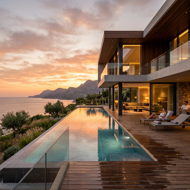
</Flex>In this variant, the image is inset with a small padding (2xs) and rounded corners, creating a modern, framed look.
1.2k
<Card w={360}>
  <Box p="2xs" pb="none">
    <CardImage
      rounded
      src="/card_architecture.png"
      alt="Architecture"
      style={{ aspectRatio: '16/9' }}
    />
  </Box>
  <CardHeader
    title="Modern Architecture"
    isVerified
    subtitle="Clean lines and minimalist design."
  />
  <CardFooter justify="between">
    <HStack gap="sm">
      <HStack gap="4xs" align="center">
        <UserOutline size={24} />
        <Text variant="title-md">1.2k</Text>
      </HStack>
    </HStack>
    <Button size="small">Read More</Button>
  </CardFooter>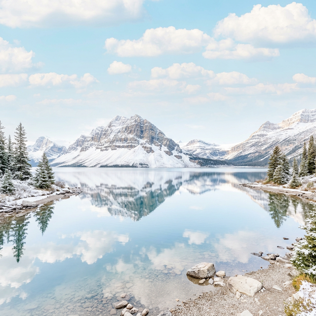
</Card>A card where the image covers the top area completely without any padding, bleeding to the edges.
842
<Card w={360}>
  <CardImage src="/card_nature.png" alt="Nature" style={{ aspectRatio: '16/9' }} />
  <CardHeader
    title="Mountain Serenity"
    isVerified
    subtitle="Exploring the peaceful peaks."
  />
  <CardFooter justify="between">
    <HStack gap="sm">
      <HStack gap="4xs" align="center">
        <UserOutline size={24} />
        <Text variant="title-md">842</Text>
      </HStack>
    </HStack>
    <Button size="small" variant="primary">Explore</Button>
  </CardFooter>
</Card>E-commerce style card with badges, ratings, and pricing displays.
Electronics
SALE
Studio Headphones Gen 3
$299.00
$350.00
<Card isHoverable w={300}>
  <CardImage src="/card_architecture.png" style={{ aspectRatio: '1/1' }} />
  {/* ... contents ... */}
</Card>Cards can be laid out horizontally, which is ideal for lists and search results.
4.8
<Card orientation="horizontal" h={160} w="100%">
  <CardImage position="left" src="/path/to/image.jpg" style={{ width: 160 }} />
  <VStack flexGrow={1} flexShrink={1} flexBasis="0%" align="stretch" minW={0}>
    <CardHeader title="Card Title" subtitle="Description content..." />
    <div style={{ flex: 1 }} />
    <CardFooter justify="end">
      <Button variant="secondary">Action</Button>
    </CardFooter>
  </VStack>
</Card>
Social Post
Cards tailored for social feeds, featuring an avatar and multiple action buttons.
AW
Just deployed the new Photonix design system update! The automatic brightness detection for overlay cards is a game changer for UX. 🚀